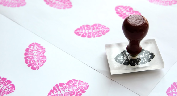
库珀:成年人的冰淇淋,宝安画册设计. 约翰逊银行与罗伯・克拉克合作设计的“美味”字体。
“库珀开始专注销售一款酒精味道的冰激凌美食风味。公司的冷冻幻想是严格对成年人和他们需要一个独特的身份和语调来匹配他们的非传统的新品牌。”宝安彩页设计 宝安产品摄影
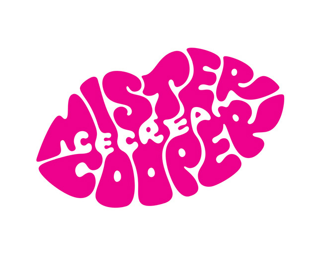
“我们面临的挑战是如何设计一个有趣的手有学问的马克利用正面和负面空间阐明品牌和嘴唇形状内的单词“冰淇淋”。
Mr Cooper: ice cream for grown-ups
Tasty custom typography by johnson banks in collaboration with Rob Clarke.
“Mr Cooper is an an ice-cream start-up specialising in alcoholic and gourmet flavours. The company’s frozen fancies are strictly for grown-ups and they needed a distinctive identity and tone of voice to match their unconventional new brand.”
黑武士摄影设计 宝安画册设计 宝安彩页设计 宝安产品摄影
|